As part of the forage digital experience for Accenture I have cleaned, modelled and generated visualizations from a social media dataset using Microsoft Excel to determine the top content categories for a social media website.
Background
The task was to analyse the data of a social media company to understand the top 5 content categories in their media. Users can react to each post using one of 16 reactions. Each reactions have a score and sentiment attached to it. The task was to use this scores to explore the top 5 content categories in the dataset. There are about 16 content categories where each post belong to for example, animals, science, tennis, etc. There are three tables of data called Reaction Types, Content, and Reactions. The Reaction Types is a reference table for the reactions and the scores associated with each reactions. The content category is the table for Posts, their IDs, the categories it belongs to and the type of media attached to it, for eg, photo, gif, video and audio. The reactions table consists of reactions to each of the posts.
ReactionTypes Table:

Content Table:

Reactions Table:

Data cleaning and modelling
To determine the top 5 content categories these tables needed to be cleaned, datatypes needed to changed and the tables needed to linked.
The category column consisted of some inconsistencies like having the categories in double quotes. These were cleaned up using the filter function in the data column. I have changed the datetime column from the reactions table to date datatype.

The tables were linked using the function Vlookup using content ID as the common field between reactions and content table. The category column was imported from the content table. The tables reaction types and the reactions were linked using the reaction types column as the common field and the scores and sentiment column were imported to the reactions table.
After linking the tables the final dataset looks as follows:

I have removed the column user ID from the reactions table as it is not useful to us in creating visualizations. I have added a new column called Month using the formula MONTH which extracts the month from the datetime column. This column will be used to visualize the trends in each month.
Analysing
I have used the pivot table feature of Excel to analyse the data. This can be done by selecting the data that you want to analyse and then clicking the pivot table feature in the insert column. This opens a sidebar with four fields (filters, rows, columns, values) and a list of all the column names.

Using this table we can find the top content categories by inserting the category feature in the rows column and the score in the values column.

This provides us with a table with categories and their sum of the scores. A simple sort method would then tell us the top 5 content categories in the dataset.

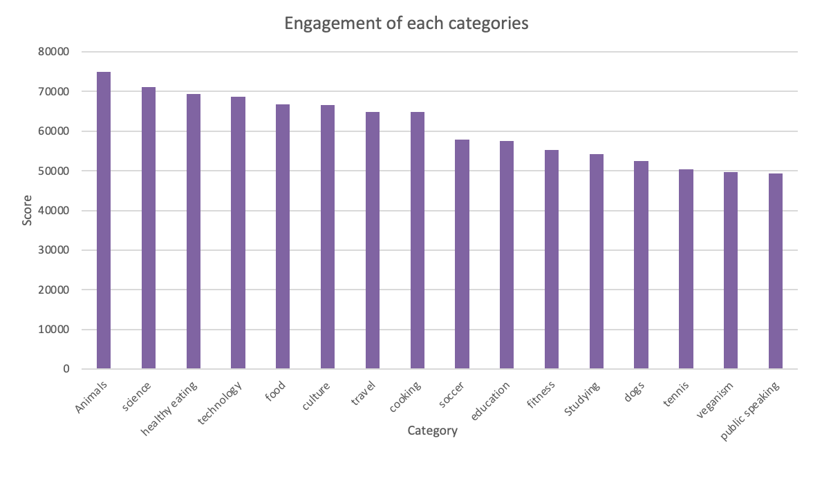
In the above image you can see the categories arranged in descending order depending on the sum of their scores. It can be seen that the top 4 categories are animals, science, healthy eating, technology and food. This table then can be selected and plotted using the charts feature in the input column.

Visualizations

The above chart shows the bar chart of categories against their sum of scores.
The same method can be used to study the relationship between different fields in the dataset and generate visualizations.

This chart shows the number of posts made in each month of the year. It can be seen most number of posts are made in the month of May, January, August and December. They are all holiday months which is when most posts are made.

This chart shows the trending categories in each month. As you can see, animals, technology and science consistently ranks the top in all the months except september, when travel is trending. This is may be due to the fact that people plan their travel for the holiday season in the month of september.

The above chart shows us the percentage of negative reactions for each category and we can see that tennis gets most percentage of negative sentiment out of all the categories due to it being a sport.
Conclusion
From the above analysis done, we can infer that the most popular categories are animals, science, technology, food and healthy living. This shows that the user base of this social media company are more inclined towards optimistic posts. This can be used to tailor the products that the company advertise like promoting brands that focus on improving the healthy lifestyle of the customer might be more successful.

